Case study · Canva Print
Redefining Canva Print editing experience
Canva's editor was built for screens. T-shirts, stickers and boxes didn't get the memo. I helped make the case for an editor that knows what you're printing and still feels like Canva, then sweated the details of three features that came out of it.
The problem
Canva editor didn't know what you were printing.
Print was treated as a publishing end-point, not part of designing. The print catalog had outgrown the editor: every product started on the same blank canvas, from business cards to T-shirts, stickers and packaging. Even bleed was one-size-fits-all: always 3 mm, for a flyer or a yard sign.
As a result, print issues surfaced late, often after people thought their designs were ready to order. The impact was significant:
- CostPreventable design errors cost $2.3 million in refunds and reprints in 2023.
- TrustCustomers continued to flag what-you-see-is-what-you-get issues, despite improving NPS.
- AccessPrint checks were buried in the print panel and unavailable on mobile.
- GrowthThe lack of print-aware editing also limited opportunities to expand into products like packaging and custom-shaped stickers.
The catch: Print sat outside Design Experience, the group that owns Canva's editor. Every change to the editor meant influencing a team we didn't belong to.
The challenge: Make the realities of physical production part of designing, without turning Canva's simple editor into prepress software.
The vision
A print-aware editor, still unmistakably Canva.
My argument: print shouldn't be an afterthought. An editor that knows what you're making can guide you to the right design and still feel like Canva.
Why a vision, not a feature request. Every editor change went through Core Editing, and one-off requests rarely got prioritised. So we pitched a bigger shift: Print owning its editing experience.
Another product designer and I built the case, and our design lead took it to leadership. It worked: PrintViz engineers began building print features in the editor, and the vision filled our roadmap for several planning cycles. I designed several of its 20+ concepts. This case study follows three.
01 · Backdrops
Design on the product, not a blank canvas.
My role. Validated the problem through user testing and interviews, led the first attempt and its rollback, iterated and shipped dynamic Backdrops, after writing the decision doc that aligned Core Editing.
 BeforeBackdrop
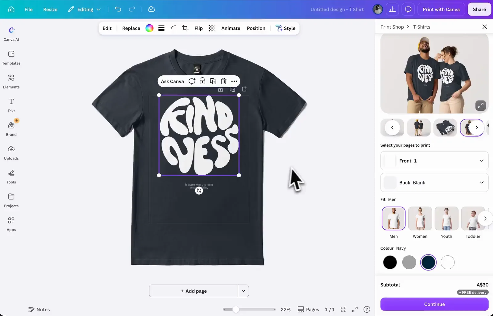
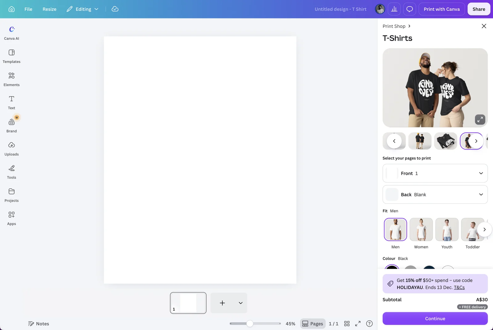
Validating the problem. Interviews and user testing confirmed my suspicion: the canvas and the print preview told different stories. Backgrounds didn't print on apparel or totes, so the preview showed the product's real colour while the editor showed white. A white logo for a black T-shirt simply vanished. And the colour picker offered white, but no way to go transparent.
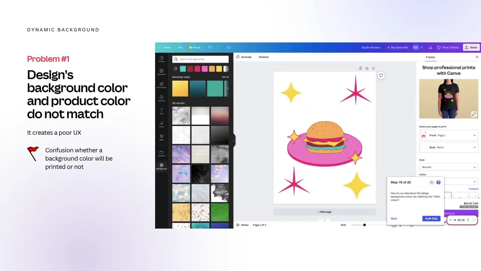
First attempt: Dynamic Background.
Picking a product colour repainted the canvas to match. It shipped, but changing someone's design without their consent was deeply confusing and raised a lot of support tickets. So we rolled it back.
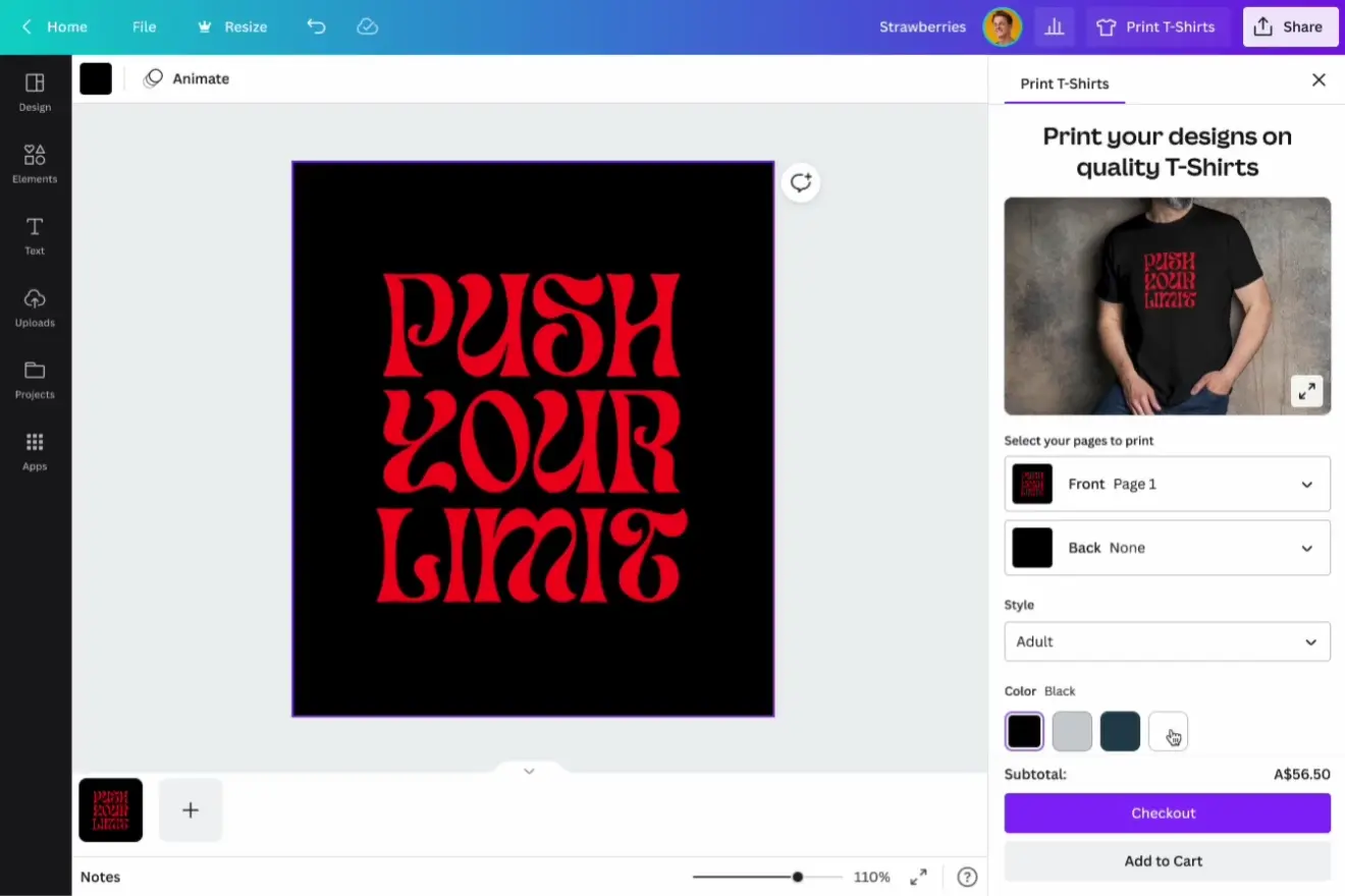
Iterating to Backdrops.
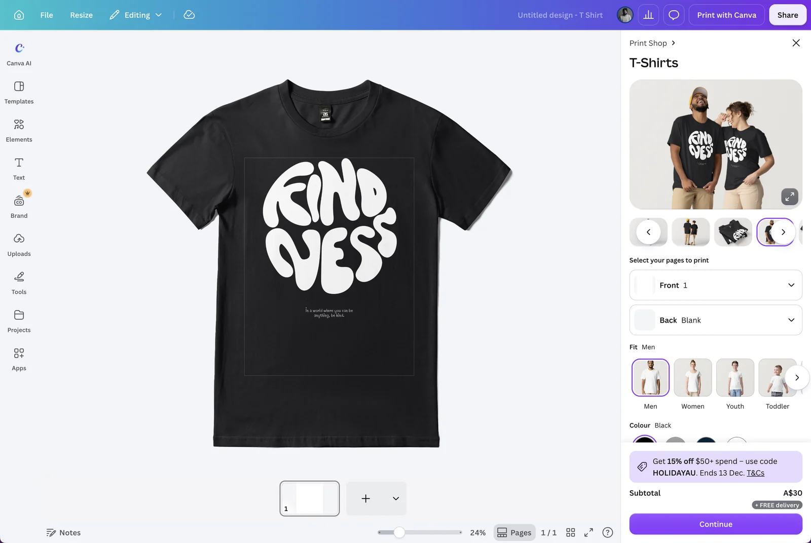
Lesson learned, I decided to separate the product from the design. The design never changes; only the context around it does. The same approach covers apparel, tote bags, mugs and more.
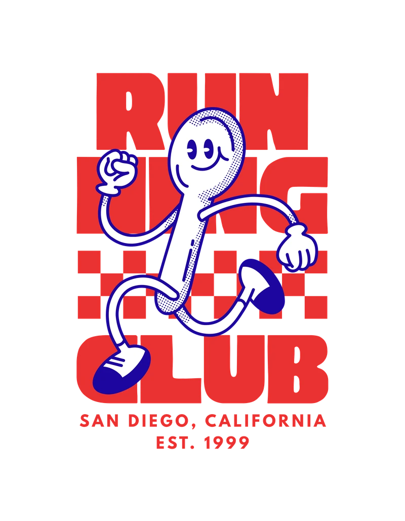
- TopHighlightBlends the design into the product.
- MiddleDesign canvasThe user's design, untouched.
- BottomProduct colourChanges with the selected product.
Keeping backdrops in sync with the product.
The first backdrops were hard-coded to the design type: every tote bag design showed the same generic tote, regardless of its size or colour. Once totes came in different sizes and colours, it looked broken. The answer was the vision's promise, a print-aware editor: once it knew the size and colour being ordered, the backdrop could follow.
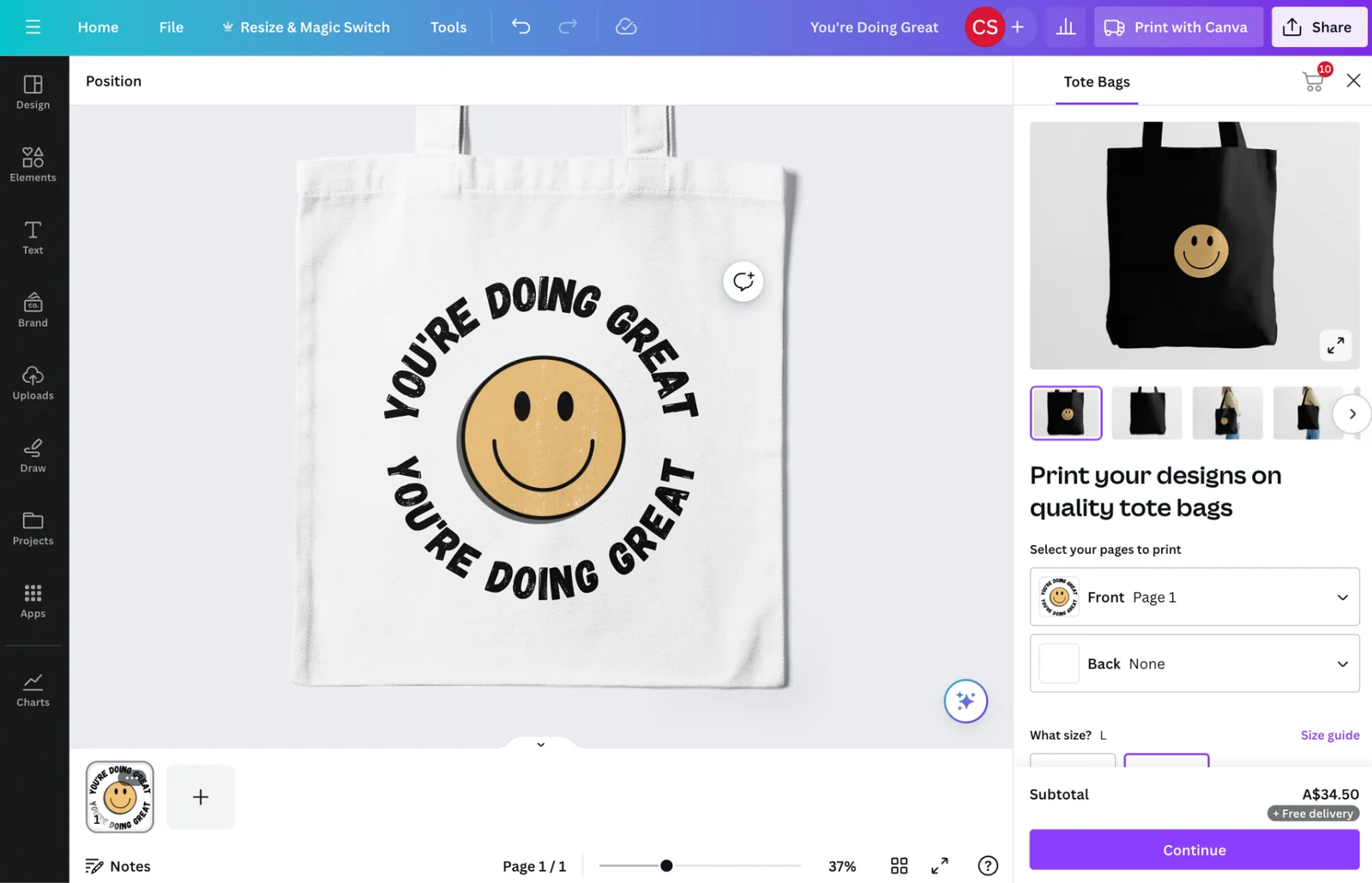
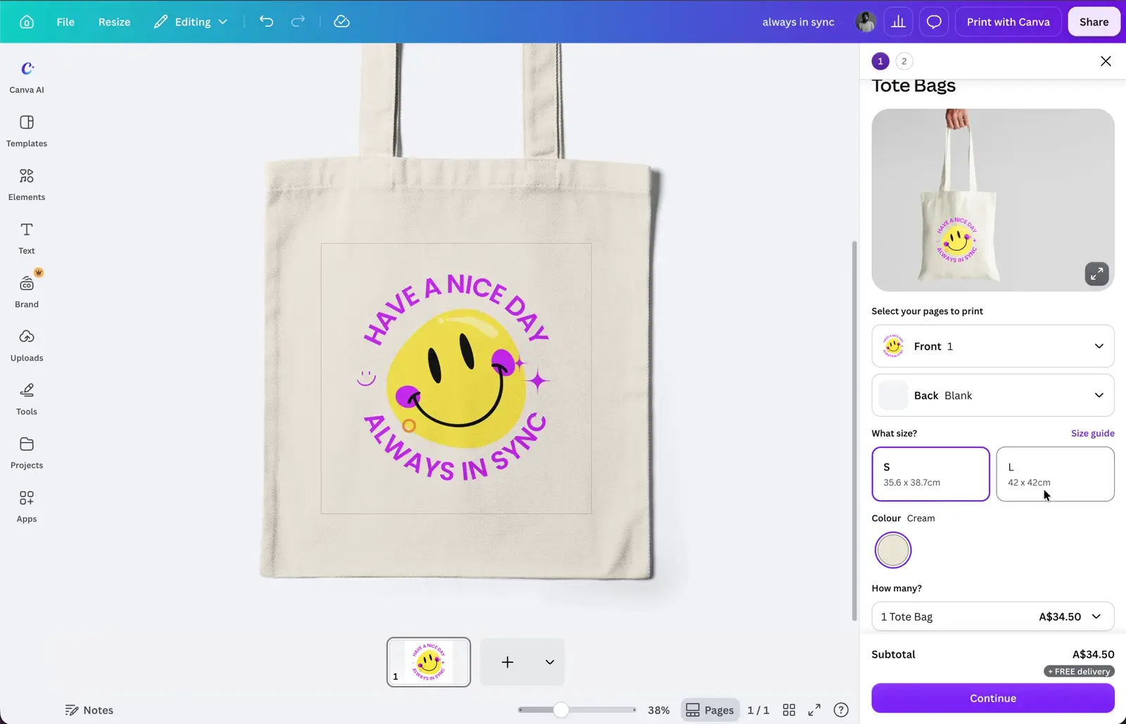
Putting intent back in the user's hands.
Historically, apparel backgrounds weren't printed to prevent costly mistakes, like accidentally printing a solid black background on a black T-shirt. But this also meant overriding user intent.
We revisited that decision: the fix targeted accidents, not intent.
We introduced a transparent option in the colour picker, making it easier to remove backgrounds, and a new proofing rule that flags backgrounds matching or closely resembling the garment colour, prompting users to confirm their intent.
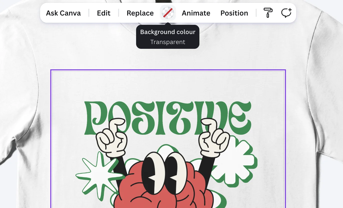
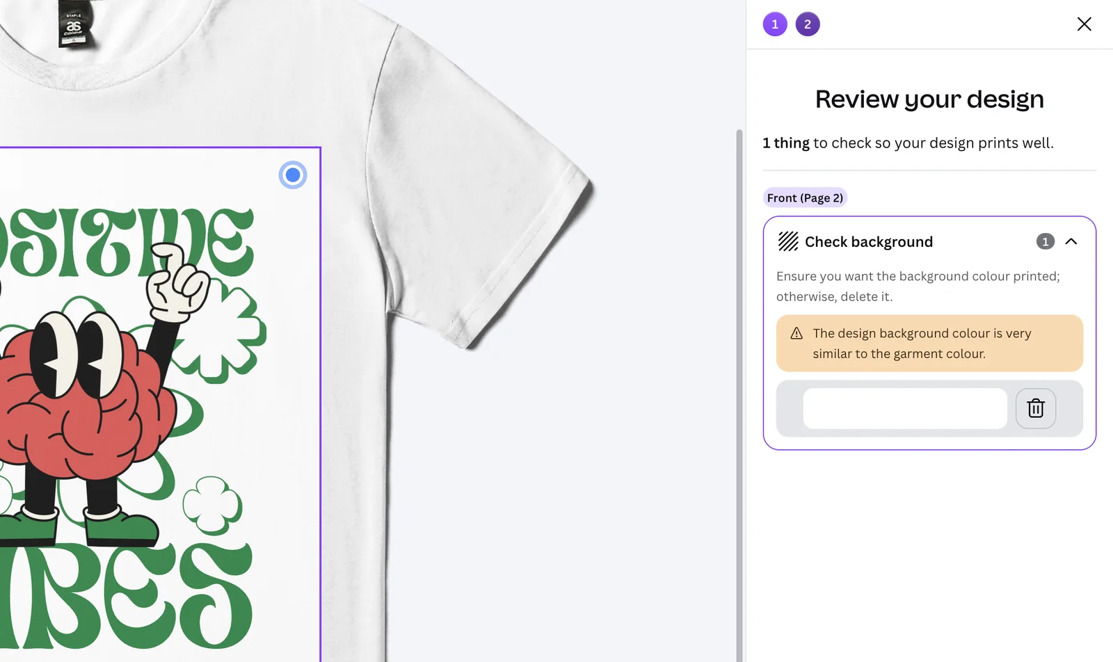
I wrote the decision doc aligning Print and Core Editing, securing sign-off from Editing's design and product leads.
Edge cases and decisions.
- Extra pages used as drafts
- Backdrops only show on the pages selected for print.
- Different front and back
- Backdrops follow the front and back pages chosen in the print panel. Products with the same surface on both sides, like totes, show it on both.
- A background close to the garment colour
- A proofer rule flags it before ordering.
- Transparent backgrounds in thumbnails and downloads
- They show as white, so downloads don’t clash with the Pro transparent-background feature.
- Mixing transparent and coloured pages
- Print exports need all pages to be one or the other, so we worked it through with the Export team.
- Wanting to see the plain canvas
- Backdrops can be shown or hidden from File > Settings or the page toolbar.
02 · Shape-aware canvas
The canvas takes the product's shape.
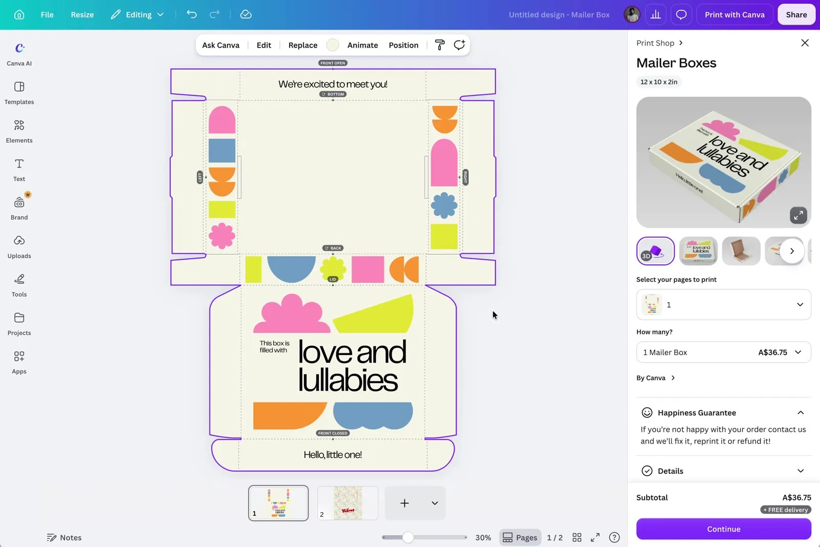
The problem. Canva's canvas is always a rectangle. A circle sticker isn't. Elements looked fine in the editor and got cut off in print, and bleed and safe zones weren't checked. Guides showed the edge, but everyone was still designing on a rectangle.
The decision. Clip the canvas to the product's shape, so designing a custom shape feels as native as anything else in Canva. One path does double duty: expanded, it's the bleed; contracted, the safe zone. Print checks now work on any shape.
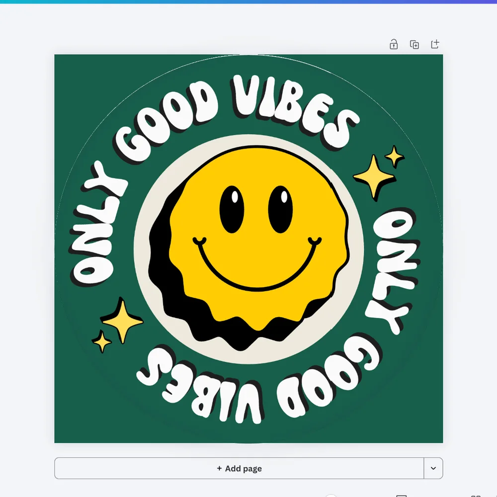
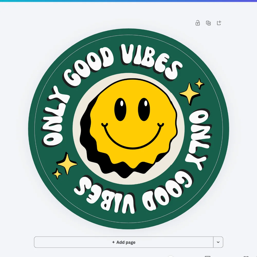
My role. Brought the idea forward, got the team behind it, and pitched it to stakeholders to get it on the roadmap.
The result. Support tickets, refunds and reprints for custom-shape products went down. [numbers, if shareable]
03 · Auto-Proofer
Issues caught and fixed before they ship.
The problem. Proofing suggestions only appeared after people picked their print options, so they often had to rethink a design they considered done. On mobile, the automated proofer wasn't there at all.
The approach. Flagging a problem is only half the job. The vision's model was a good print shop: it spots common issues and fixes them for you. Auto-Proofer flags print issues and fixes them automatically where it can, before the order goes through.
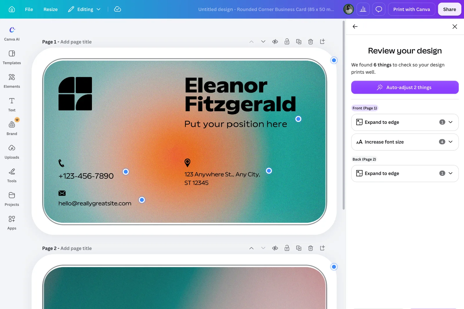
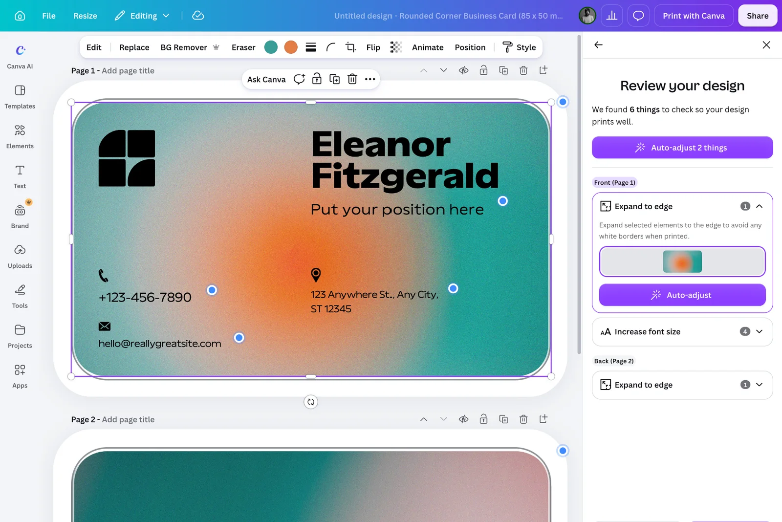
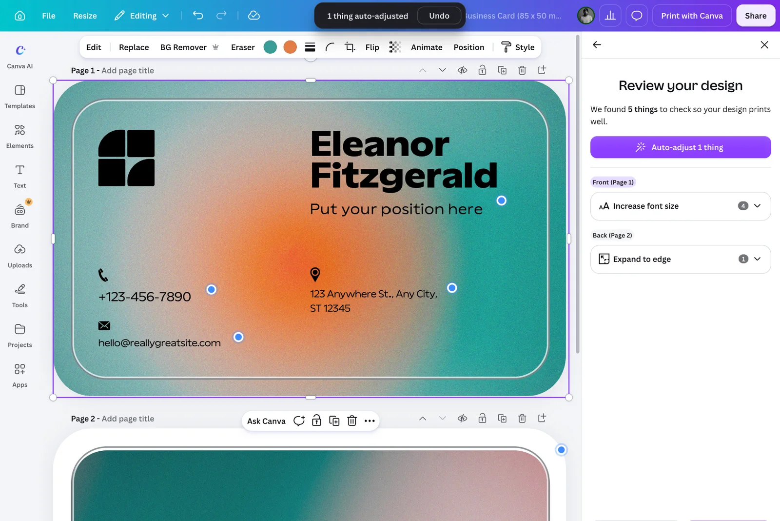
Under the hood. It runs on a configurable linting service from engineering, so rules apply across products and can extend beyond print. Designers in Brand and Accessibility helped keep it consistent with checks elsewhere in Canva.
My role. Designed the Auto-Proofer experience from the ground up. Engineering built the linting service it runs on.
Results
The editor now tells the truth about the product.
Its colour, its shape and its problems, while people are still designing. Fewer orders end in reprints and refunds.
Takeaways
What I took away.
- A shared vision beats one-off requests.Working from outside the editor team, the vision gave every change a reason and a place on the roadmap.
- Simple doesn't mean exposing the complexity.Sometimes it's a new interaction. Often it's an old pattern in a new context, or catching a problem before anyone notices.
- Ship, learn, iterate.Dynamic Background shipped and confused people. Rolling it back and returning to the problem is what led to Backdrops.